

|
Having touched upon the issues of the interface icon set, their stylistics and sizes, it is time to start creating them. This article covers the basics of computer drawing. Also I tried to systematize all icon stamps with established outline and meaning, which is not going to change. I hope this article will be useful to both web-designers and beginner artists. When creating an icon, the designer can face to situations: either the icon must be made using an existing object (i.e. there is a photo, picture etc.) or it must be made out of its “verbal representation” (there is no visual representation, the object is described in words). Both these tasks can be solved and I will describe it starting with the latter in order to make the story consistent.
1. Image visualization.When receiving a task to draw some object, almost every designer starts to draw what he thinks to be the main from of this object. This is totally incorrect. For example, you need to draw a phone. Phones can be mobile, home, rotary, push-button and others. There is no a single form of a phone; all phones are different, however you must make a choice. Here designer should use help of qualified marketing specialists or his own common sense. If the majority of the site visitors are businessmen, we draw a mobile phone, because it is more familiar to them, this is their representation of a phone. If the site is intended primarily for housewives, we draw a home phone because they see and use it more often, this is their representation of a phone.Of course, there are no rules without exceptions. In this rule, exceptions are dictated by the website style. When designing an antiquarian shop in the “antique” style, you should use the mobile phone for the “contact” page. Of course, people who buy these things are not poor; they know what mobile phone is and maybe it is their representation of the phone but it completely destroys the logic of the site itself. It makes a so called insuperable contrast. It always appears between equidistant red and blue colors and disjoint centuries such as 19th and 21st. Such strong contrast needs to be smoothed by a great number of details. As a conclusion, we can note that the visual form of the object is dictated first by the site stylistics and second by the preferences of the site users.
2. Creating composition.Having determined and finally approved the object appearance, the designer must move its image into a graphic form. Turn off the computer and take a sheet of paper. All drafts and sketches are made using a traditional approach. Photoshop, CorelDraw and Illustrator will only cause harm. Don’t be afraid of such an archaic method; all professional designers start working on their projects using a sheet of paper.Sit comfortably, take a pencil and start drawing the object. Draw as many variants as you want, gradually approaching the accuracy and stylistics of the website. The greatest problem that the artist must overcome is not the problem of technique or inspiration. The greatest problem is the lack of vision. When people live every day of their lives, they don’t see. They look. There is a simple explanation: no one is able to notice every detail of our surroundings. Thus, the human brain filters out the details. When you are walking, you see the road, pavement, other people and buildings. You don’t notice fissures in asphalt or grass growing through them; quality of the pavement or type of cars; expressions of people’s faces; texture of building bricks. All these things are transmitted to you on the subconscious level. The left cerebral hemisphere is responsible for this filtration. It replaces building bricks with the “wall”, “Mercedes” with “Car”. But when you start to specifically notice and examine the things around you, you can put in action the other part of your brain – the right hemisphere. The right hemisphere is what controls your subconsciousness, your instincts. Speaking is the function of the right hemisphere; when you are talking you don’t think about nouns, prepositions, adjectives, adverbs, personal pronouns and verbs. However, when most people draw, they do it as if they are thinking. To draw a human, you draw head, body, two hands and two legs, feet, hair and clothes. But you don’t draw directly legs, hands, head etc. You just draw symbols, i.e. what you know about these things. Legs are two long lines, sometimes slightly curved. Head is an elongated circle. In short, you draw what you imagine these things to be and not what they are in reality. These are truly competent words; however, I would add a couple of points from myself taking into account the specifics of pixel graphics.
3. Determining details.Try to draw a human in 5 seconds. And now draw a clock. Look at your pictures. I bet that in the first case you drew five lines and a circle (legs, hands, head and body) and in the second case – circle and two lines (clock body and arrows). Such simple exercise can help you determine the primary details of the object.The problem is that the icon size often doesn’t allow us to draw an object in full detail. Try to put a human into a 100x100 or 16x16 square. This is not possible, so an icon must represent the essence of the object, not the object itself.
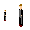
Here is an example: The object size is 7x37 pixels (the right picture is two times larger). Of course this is not the smallest variant but it is enough for an example. What can you see in the picture? This is a man in a suit, probably a businessman with dark hair and brown boots. This is clearly seen. The picture doesn’t have mouth, moustache or beard. The face is determined by the single pixel, which depicts an eye. Only the primary details of a man are drawn in the picture. When drawing icons, pay special attention to the characteristic details of objects.
4. Minimalism.Here is one more example:
This is also a man and in the same size. You can see hands and legs and head but as a whole it looks dirty and untidy, just as a mess of pixels. This “effect” is achieved by simple scaling of a normal photograph. Of course, the photograph is a 100% correct representation of the object. This is very useful when using photographs as, say, illustrations, but is absolutely wrong for miniature graphics. This is why the art of icon design is not dead. Nevertheless, what makes a photograph so bad for using as a miniature? The answer is rather simple: the details. In the former case, the man was drawn from stretch. It lacks irrelevant details because we themselves complete the image; we don’t need secondary details. When working with such small graphics, it is simply impossible to draw every detail of the object. Therefore, minimalism is the basics of icon graphics.
Before we proceed to the next chapter, here is a special example of balanced details and minimalism for owners of mobile phones: What type and model this phone is?
5. Creating action.Very often, the designer must depict an action in the icon. The simplest solution is animation but in most cases animation is bad. In the previous article I already wrote that interfaces must not distract the user attention from the content. When using animation, the attention is immediately distracted, so we won’t use it (though when using JavaScript for onMouseOver it can be justified but this is another topic). To understand the basics of dynamics, the book of recreational physics can help. If you doesn’t have it by hand, I’ll try to describe the basics in short.
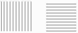
The first what can help is completion of the composition by the user. Here is the well known example:
The right picture looks more dynamically than the left one though they are absolutely identical except the second picture is turned 90 degrees. The effect is simple. Think about how action is performed. Running, racing, shooting. All these things happen in horizontal plane, so the horizontal line is associated with dynamics and the vertical line is associated with rest. That’s why they make fonts with serifs and arrows with heads. For the sake of experiment, open any picture in Photoshop and apply Motion Blur. Dynamics is guaranteed. So, first, to create an effect of motion, the composition must be made primarily in horizontal. In addition, you can use another trick for creating motion. I permit myself to include some more information from "Traditional animation by Walter Croft". There is an idea of notice. I.e. when we throw a ball, we don’t simply throw it, but move the hand backwards to make a stroke. If we jump into water, we don’t just jump; we squat to make a push to make the jump longer. Action before action is notice. Using notices is very useful when drawing icons. The composition looks like a freeze frame. The user sees the object, sees its position and his imagination completes the action, which the objects starts to perform. However, not all dynamics is an action. There are cases when the object shouldn’t jump, run and hop. For example, you need to draw a pencil writing on the paper, ringing phone, opening door or any other action not related to man. Again, we must use animational tricks. This time the trick is called contraction and stretching. The principle is very simple: any object doesn’t change its volume when being transformed. For example, let’s take a door. The primary force affecting the door will be situated near the handle. Thus, having slightly distorted the reality, you can decrease its thickness in this place. But the volume is not gone so the part of the door (imagine it as being filled with dense gel), which moved from the handle must move the edges. So, the top and bottom of the door are thick and the middle part is thin. Having distorted the reality a bit more, you can push the edges of the door in the direction opposite to the moving direction as if the edges don’t manage to make it after the rapidly moving center of the door. The main thing is not to go too far; otherwise the distorted object will look as if it happened to be in the epicenter of the nuclear explosion. In principle, this is everything I could describe. Finish your composition, turn on the computer an scan it.
6. Transferring image.Having opened the scanned image into your favorite graphic editors (the only important thing is that this must be a raster editor), you can start creating the graphic file, which will become an icon. I’ll dedicate a separate article to working with the graphic editor, and in this one I’ll cover the only the main issues. First, minimalism and details. Never forget about them, otherwise you will get either dirt or featureless spot. Second, always maintain proportions. When working with icons, proportions are calculated in percents from the original size. So, if the icon is two times less than the original, all details in the icon are two times less the size of original details. Third, always start your work by creating contours. Leave filling, dithering and shadows for later. Create contours of the object, edit them and mark the primary details. These are purely technical details, which, again, I’ll cover in the next article.
7. Icon stamps.Finally, before puzzling over an object for the icon, think about its functionality. There are quite many established images, and it doesn’t make sense to change them. This table systematizes the most well-known images and their functions.
Because of popularity of Windows, the following images are also established: And many other. | ||||||||||||||||||||||||||||||||||||||||
|
| ||||||||||||||||||||||||||||||||||||||||
|
Copyright © 2006-2022 Aha-Soft. All rights reserved. |
|


